How to Photograph Your Own Artwork for Portfolios, Prints, and Social Media
Photographing your own work is one of those skills that pays for itself the first time a gallery, a print buyer, or a festival organiser asks for images. The good news is that you do not need a studio. A wall, a window, and a little patience will get you most of the way. What separates a usable photograph from a disappointing one is rarely the camera. It is the light, the alignment, and the care you take before and after you press the shutter.
Start With the Light, Not the Camera
Direct sunlight is the enemy. It burns out pale areas, deepens shadows that are not really there, and changes while you work. Find a wall that receives soft, indirect daylight — a north-facing window is ideal in the northern hemisphere — and hang the piece there.
Overcast days are wonderful for this. If the sky is bright and flat, you can usually shoot all afternoon with almost no adjustment between frames.
Turn off the overhead lights. Ceiling bulbs and window light have different colour temperatures, and your camera will make one of them wrong. Mixed light is worse than bad light. If you have to shoot in the evening, use two identical lamps at roughly 45 degrees to either side of the work, the same distance away, at the same power, and diffuse each one through a sheet of tracing paper or a white shower curtain.
Stand the work upright rather than laying it flat. You avoid casting your own shadow across it, and you avoid stepping on it. A neutral wall, a clamped board, or an easel all work.
Line the Camera Up With the Work
If you photograph a rectangle from an angle, it becomes a trapezoid: the near edge wider than the far one. This is the single most common problem in artwork photography, and it is almost impossible to fix convincingly later.
Put the camera on a tripod or a stable stack of books. Set the height at the middle of the artwork. Point the lens straight at the surface so it is parallel to the piece both left to right and top to bottom. On a phone, switch on the grid and use the edges of the frame as a guide.
Then stand back and zoom in slightly, or move closer and crop later, rather than pushing the camera right up against the work with a wide lens. Wide lenses bend straight lines near the edges of the frame. A modest zoom keeps proportions honest.
Focus on the middle of the piece, lock focus and exposure, and use the two-second timer, a cable release, or your phone's voice shutter. Your hand on the camera will blur more frames than a slow shutter speed ever will.
A quick alignment check before you shoot
- Camera height at the midpoint of the artwork
- Lens parallel to the surface in both directions
- All four edges visible, with a small margin of background around them
- Nothing in the frame but the work and its background
- Lights, if used, equal distance at 45 degrees either side
- Shutter fired without your hand touching the camera
Choose a Background That Stays Quiet
Matte grey paper is the safest default for most work. White suits bright, colourful pieces; black makes pale or highly textured work appear to float. Tape the paper to the wall behind the piece and let it curve down and forward so there is no visible join behind the artwork.
Skip the wood grain, the patterned wallpaper, the bedspread. They compete with the work and they date the photograph. Leave a narrow border of background on all four sides rather than cropping tight to the edge — it reads as deliberate rather than accidental.
For glazed or framed pieces, glare is the main obstacle. Angle the work very slightly away from your light source, check for reflections of your own clothing (wear something dark), and step to one side between frames to see what the camera is seeing. A polarising filter helps, but only if your light is already controlled.
Settings That Keep Colour and Detail Honest
Shoot raw if your camera allows it. A large, fine-quality JPEG is workable, but raw gives you room to correct white balance without damaging the file.
Include a grey card or a sheet of neutral paper in the first frame of every session. It takes ten seconds and it lets you set colour accurately later, especially when you are photographing a series and every image needs to match the next.
Aperture: around f/8 on a DSLR or mirrorless camera gives even sharpness across a flat surface. On a phone, the default lens is usually fine — just avoid digital zoom, which softens detail.
ISO: as low as your light allows, typically 100 or 200. If the shutter speed drops below about 1/60 second, use the timer rather than raising ISO.
Flash: leave it off. Built-in flash flattens texture and throws a hard shadow behind the frame.
Edit to Correct, Not to Improve
Editing your artwork should be a corrective process. Straighten the image, because a rotation of half a degree is visible on a square canvas. Crop to leave a consistent margin. Use the grey card frame to set white balance, then apply the same setting to the rest of the session. Adjust exposure until the paper reads as paper and the shadows still hold detail.
Remove dust spots and stray hairs with a clone or heal tool. Then stop. Resist the urge to push saturation or contrast; anyone who sees the actual piece later will feel quietly cheated, and your photographs will not match each other across a portfolio.
Keep a master file of every image: full resolution, uncropped, unsharpened, in TIFF or a high-quality JPEG alongside the raw. Export working copies from the master and never from an export.
Prepare a File for Each Destination
- Prints: full resolution, saved as TIFF or a maximum-quality JPEG, with the colour profile your printer or lab requests. Ask them before you guess.
- Website and portfolio: sRGB colour, resized to the largest dimensions the site will display, then sharpened lightly after resizing.
- Social media: sRGB, generous margins, and a crop that keeps the whole work visible in the squares and rectangles most platforms use.
- Applications and records: a whole-work shot, two or three detail shots, and a note of dimensions, medium, and year in the file name or caption.
Do Not Forget the Details
Close-ups of texture, edges, signature, and stitching tell a viewer far more than a single flat image. Photograph them in the same session, with the same light, so the tones match. If scale is unclear, include a hand, a coin, or a ruler in one frame. Consistency across a set of images is what makes a body of work look considered.
Make It a Routine You Can Repeat
Write down your setup: the wall, the height of the tripod, the distance, the lens, the aperture, the time of day. Next time, the shoot takes half as long and the images sit together properly.
Before you pack up, check every frame at full size on a screen. A hair across a corner or a soft edge is easy to miss on a phone. If you are submitting to a gallery, a competition, or a print fair, follow their file specifications exactly — the right size, the right format, the right naming. That, more than the camera you own, is what marks you as someone who takes the work seriously.
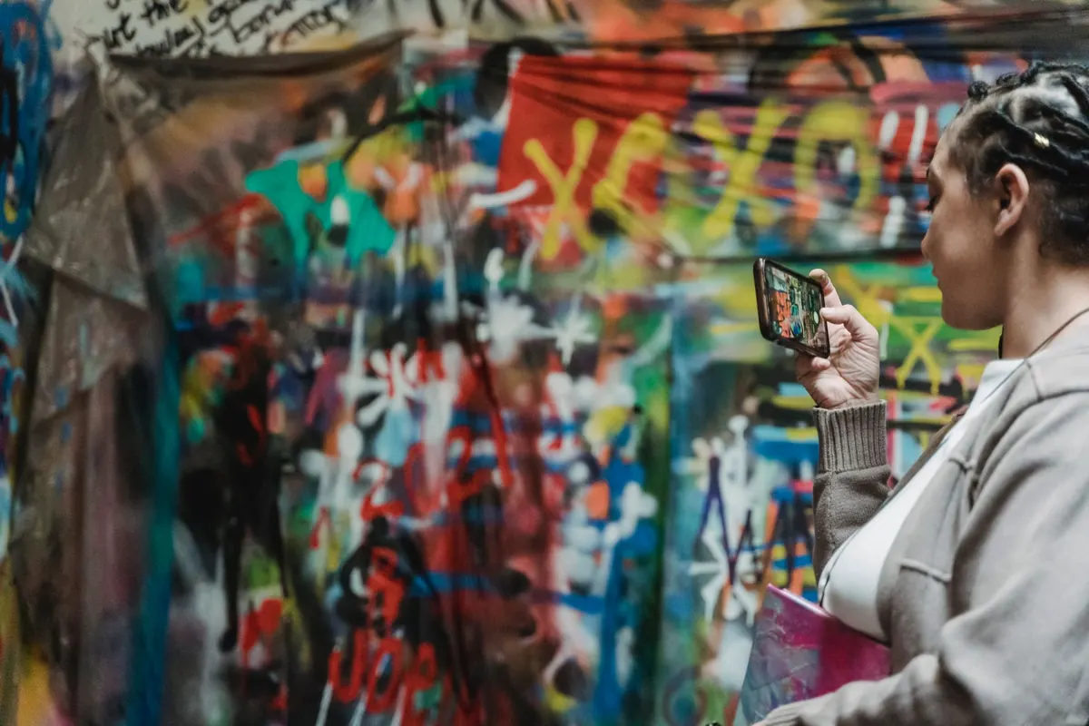
Photo: Felicity Tai / Pexels